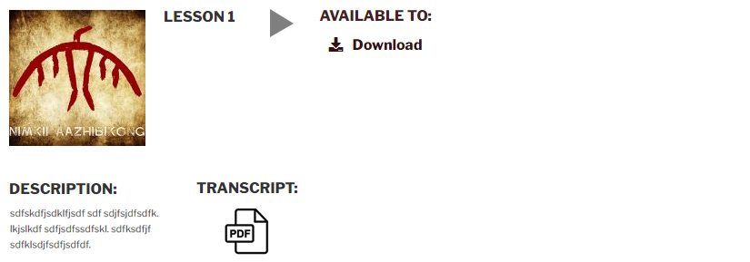
[NOTE: To Christi – will transcript PDFs from 1-5 be coming? ]
[NOTE: What is below was the layout samples / dev tests from previous work in June]


My suggestions would be:
– consider removing text for icons under download
– for mobile if Christi is attached to the idea of having it fully horizontal, perhaps hiding some elements would be advisable (like the artwork or the sound wave)
– if a column layout would be ok on mobile, I would suggest dropping ‘download’ and ‘transcript’ and maybe the description to a new row. not a full column I guess, but having it wrap 🙂
ADDED LS 210520 from other audio page
PREFERRED LAYOUT
Have Player Icon go after Thumbnail and add Description option under Title area

OR
If the player icon can’t go beside Thumbnail and Description can’t go under Title order as below

ALTERNATIVE LAYOUT
Add in Description and Transcript Column, if it can’t be styled in order above add extra column items to the right of the plugin’s item options

ALTERNATIVE LAYOUT
If additional columns cannot be styled within the plugin then Description and Transcript will go below the plugin row

Considerations:
- Where does the player timeline go? It is an important feature to allow the visitor to toggle forward and back in the audio track and also know the length. Is there a possible design solution?
- Client request – thin light gray lines to demarcate the rows and columns. We could try this first, my concern is it may look too busy.
ROW WITH VOCAB BOOSTERS & EAR TUNEUPS THUMBS


[NOTE: Below added by LS copied from current Language Lessons page]
Nimkii Aazhibikong Audio Lessons for Language Warriors is a series of audio lessons available for download. These audio lessons have been produced at Nimkii Aazhibikong in partnership with Eshki Nishnaabemjig and with the kind financial support of The Cultural Conservancy.
More resources will be added as they are developed. Check back often.
